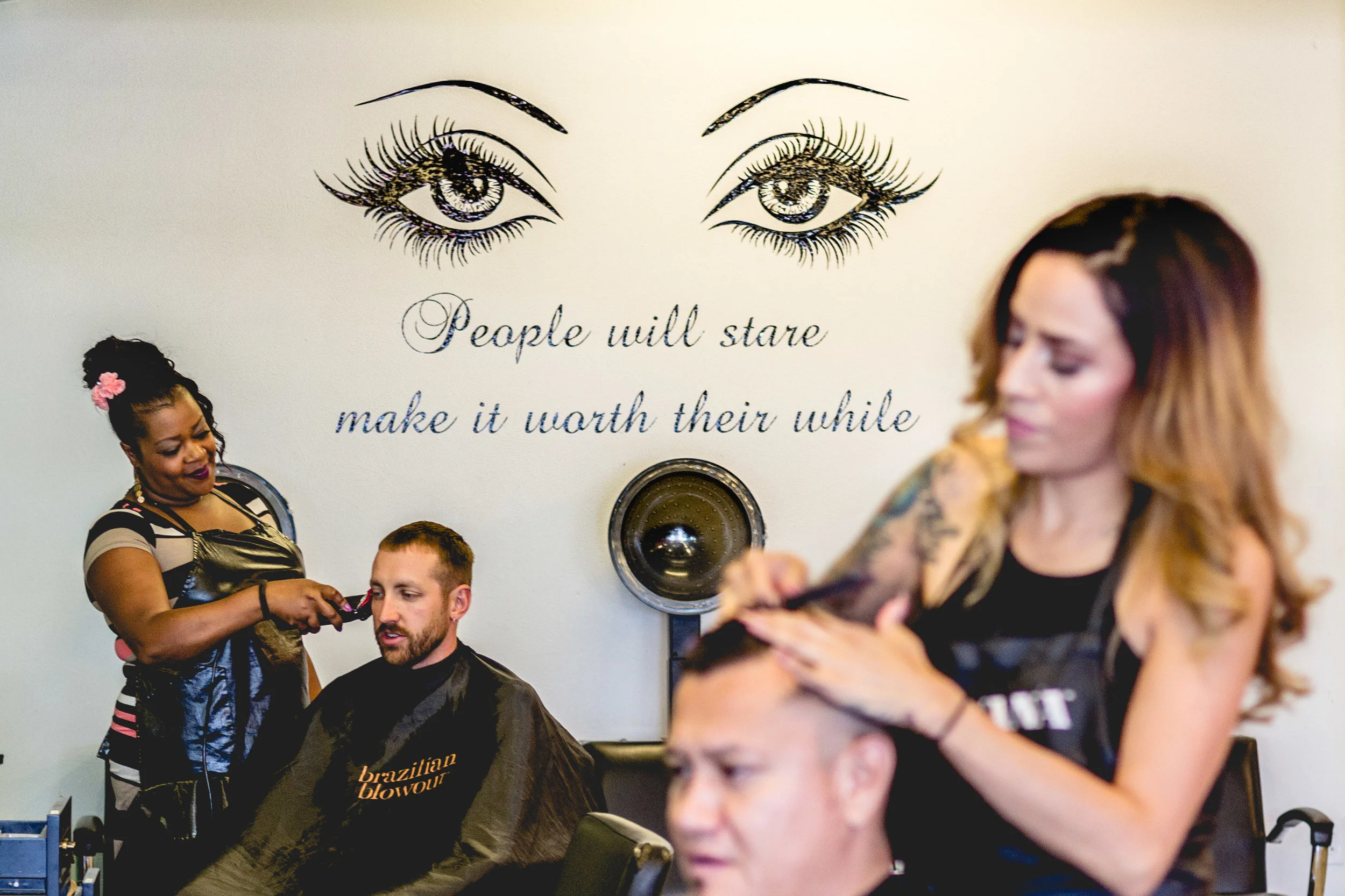
Oooh Girl Who Did Your Hair Salon and Spa
Had the chance to hang out with the great team at Oooh Girl. They are a full-service salon and spa. They have a very welcoming and family friendly place.
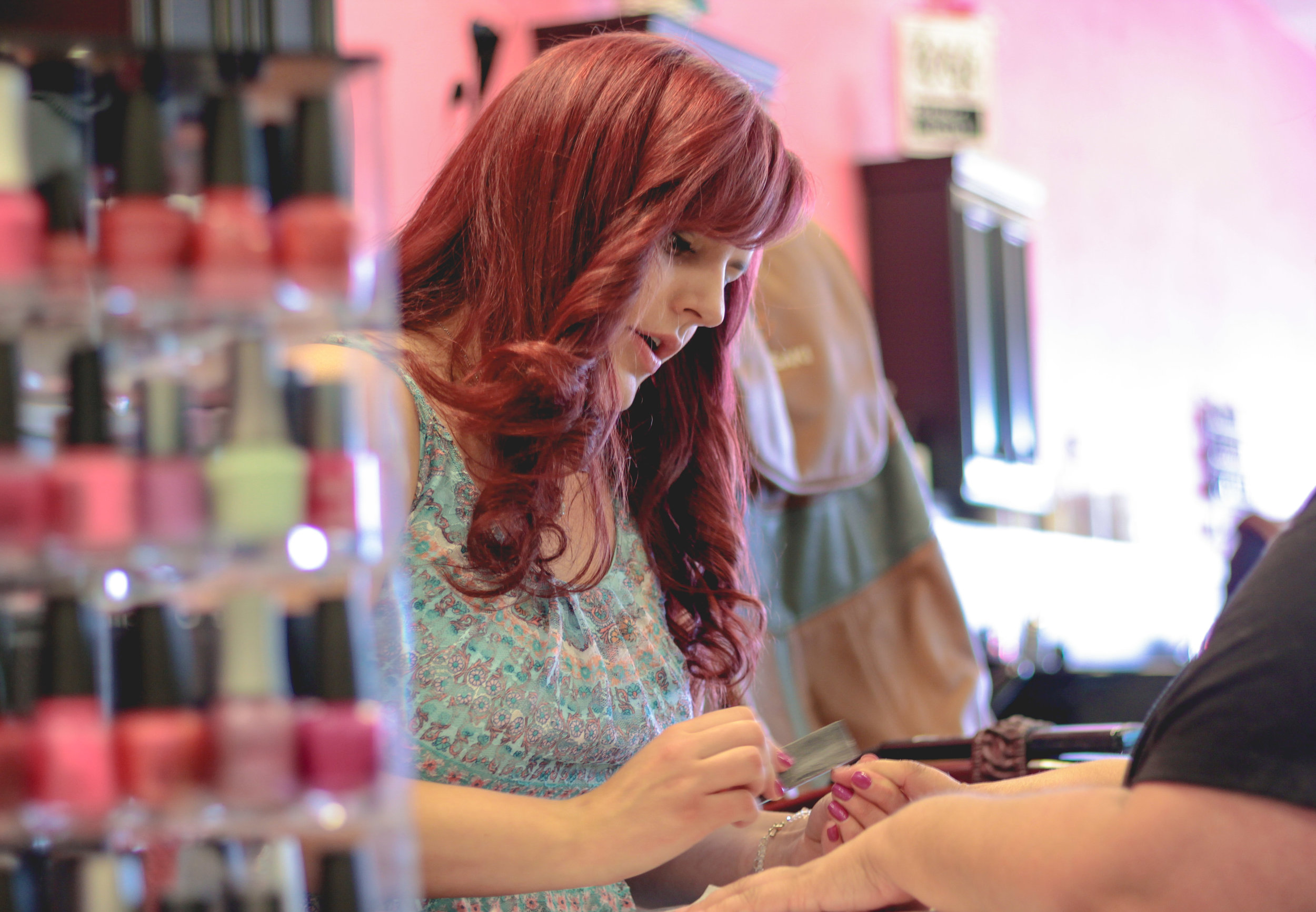
Had the chance to hang out with the great team at Oooh Girl. They are a full-service salon and spa. They have a very welcoming and family friendly place.
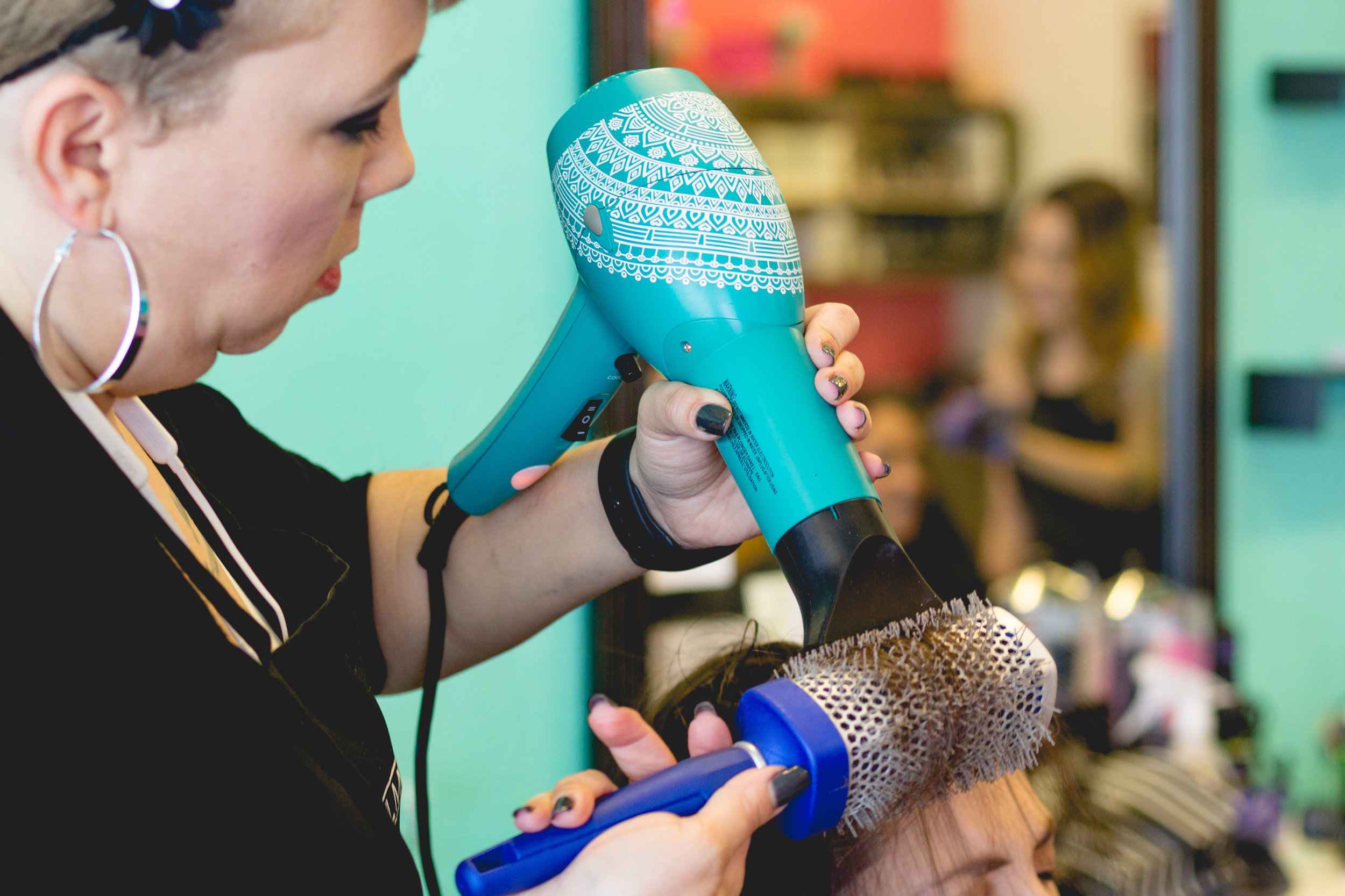
Hair Stylist with blowdrier.
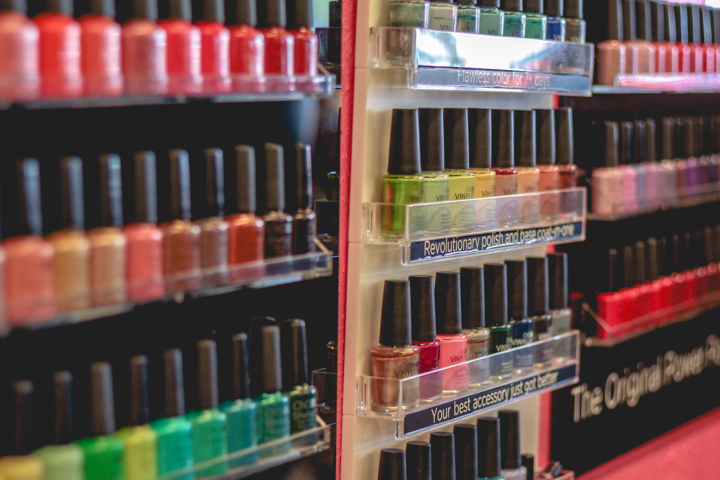
Wall of nail polish and colors.

Logo design for Parcel Cafe. A subscription based company that sends its clients local New Mexico Coffee. The Client wanted a gold color pallet. So the best way to get that across for print and digital was to do a gradient.


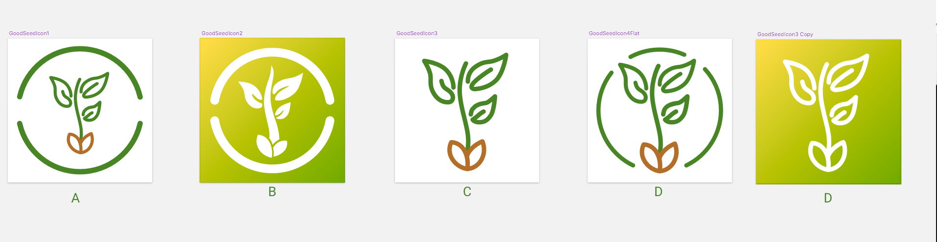
Good Seed App got with me to do a quick turnaround on an app icon design. The client requested an app icon that had a clean, simple design.
I went circle crazy this time. This was a very new way for me to design logo/app icons. I have always done shapes and cut outs with my UI icons for navication and tabs, but never a full design. I loved it and will be using this method more often.


For the splash screen I continued using the same green gradient from the app icon and a centered logo.
(Below) There were a lot of different paths that we explored. I wanted to try a line icon. But when I was testing it out on my physical devices (Thank you sketch app mirror) the lines blurred together and it turned into a blob. Because icons are small even with a high resolution on devices.
Differnt Mock ups.

The App Buisness card
Pixegon is a mobile app development company. That build world-class iOS applications. They have been developing iOS applications and managing iOS teams since 2008.
I created a website that explained what and how they do projects. As well as showcase some of their past clients case studies on some of thier most succeful projects.
pixegon.com
The client wanted a bright, simple logo. The logo mark incorporates the 'p' from the company name and pixels. It was fun trying to imagine what a "pixegon" shape would look like.

Thumbnail Sketches from the discovery phase of the Pixegon logo creation.