A startup New Mexico Subscription apparel company.
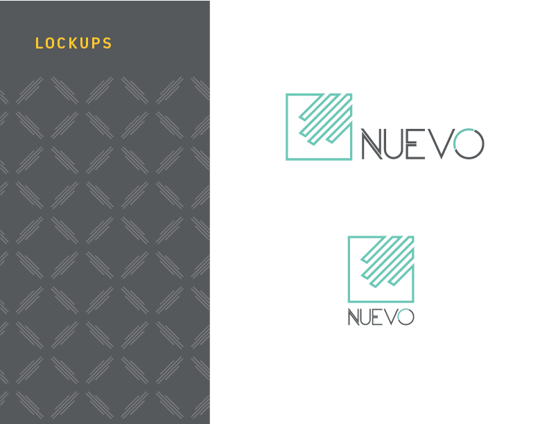
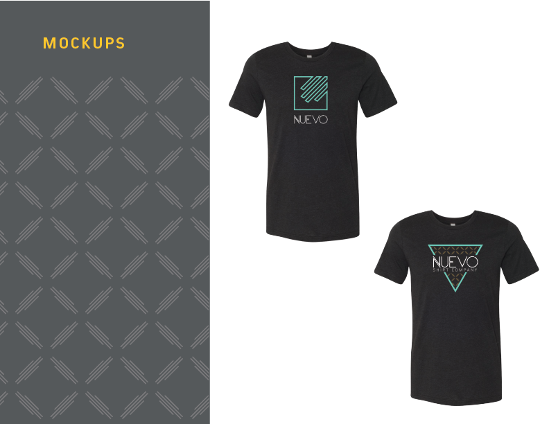
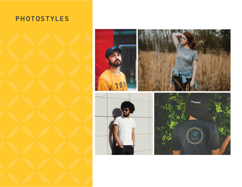

A startup New Mexico Subscription apparel company.


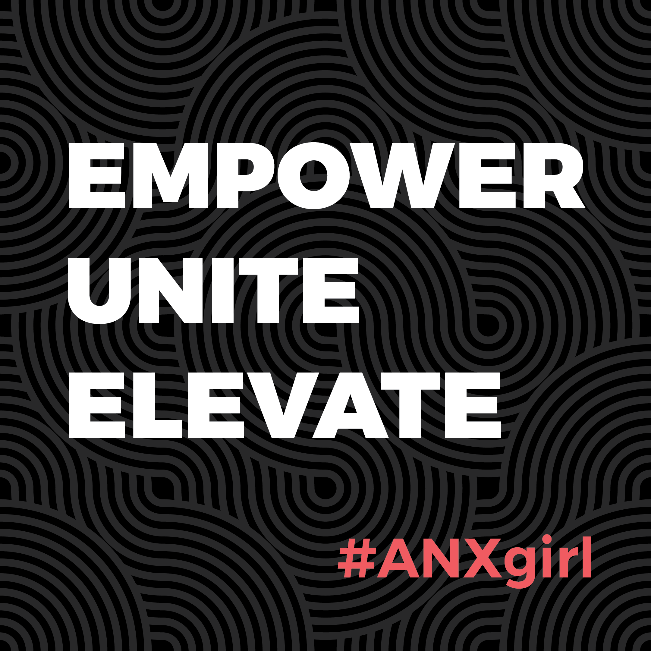
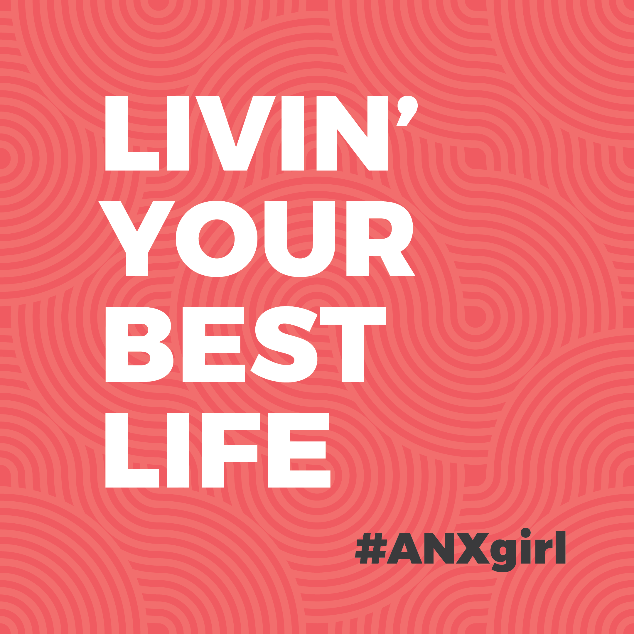
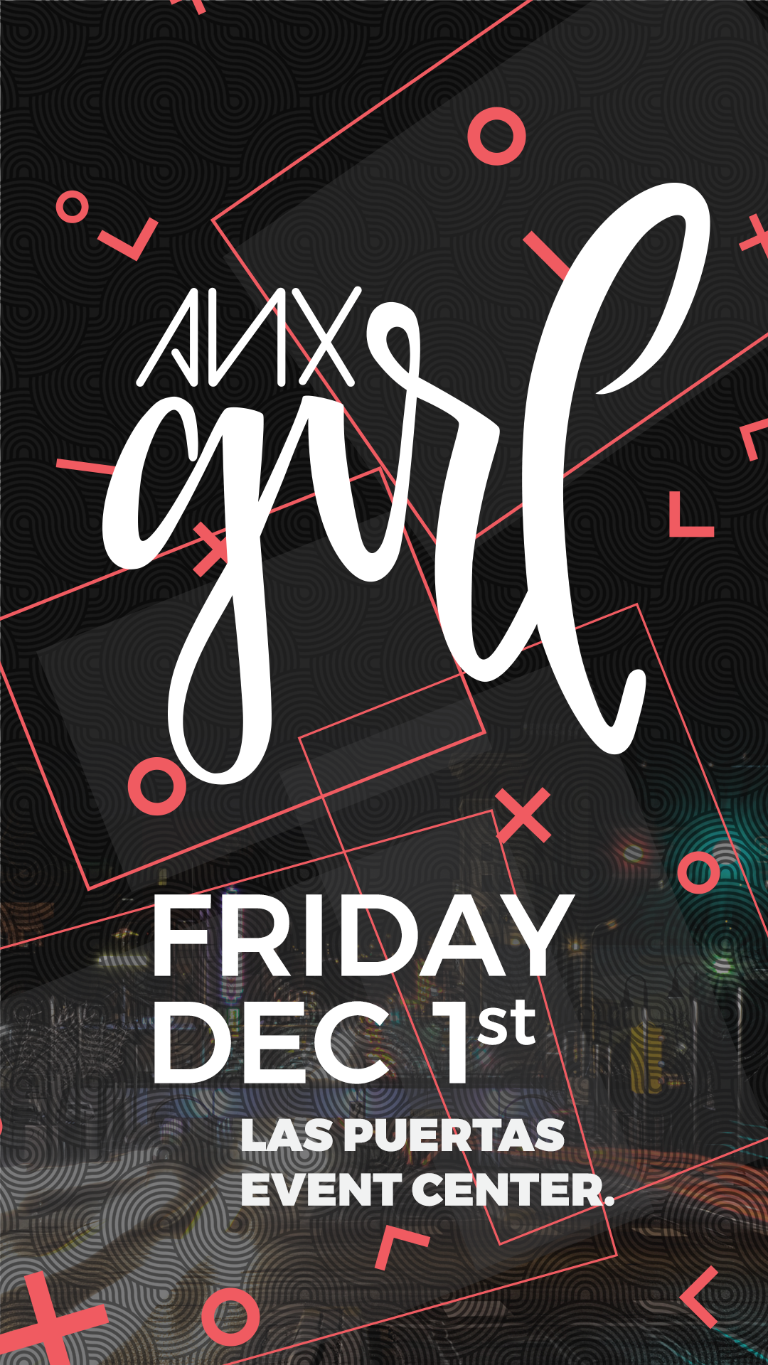
ANX Girl was a special worship experience put on by ANX that was dedicated to all the ladies. They wanted to stay within the branding but still have it distinct from there main branding. I ended up using there ANX red with a black theme and it made the red look pink. Which gave it a slightly more feminine vibe. The poster logo was drawn out by the Pastors wife and I turned it into a vector.

One of the things they wanted printing with hand-held signs to let the ladies know where the event was and promote it to passers-by. These were a few of the designs that we came up with.

This is a few of there social media shareables and a mock up of the shirt. The logo for the event has been modified to match the ANX branding. It was decided that the script font didn't reflect the branding and made it look like a singular event.

FB Post

T-Shirts
Instagram Story

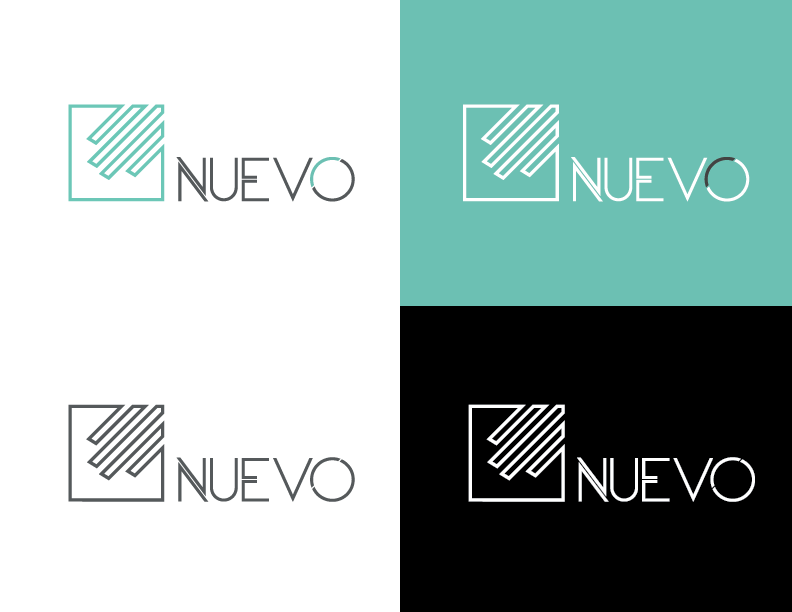
Logo design for Parcel Cafe. A subscription based company that sends its clients local New Mexico Coffee. The Client wanted a gold color pallet. So the best way to get that across for print and digital was to do a gradient.


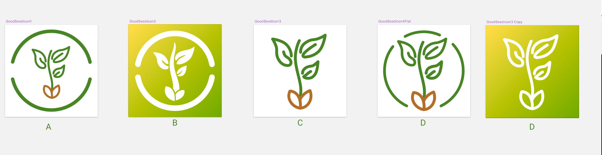
Good Seed App got with me to do a quick turnaround on an app icon design. The client requested an app icon that had a clean, simple design.
I went circle crazy this time. This was a very new way for me to design logo/app icons. I have always done shapes and cut outs with my UI icons for navication and tabs, but never a full design. I loved it and will be using this method more often.


For the splash screen I continued using the same green gradient from the app icon and a centered logo.
(Below) There were a lot of different paths that we explored. I wanted to try a line icon. But when I was testing it out on my physical devices (Thank you sketch app mirror) the lines blurred together and it turned into a blob. Because icons are small even with a high resolution on devices.
Differnt Mock ups.

The App Buisness card